
Modernizing the Legacy Chat Experience
Redesigned a legacy web chat interface within a cloud contact-center platform to reduce friction and make it easier for users to connect with sales and support.
ROLE UX Designer & Researcher
TOOLS Figma, FigJam
TEAM 1 developer, 1 product manager, 1 project manager
TIMEFRAME 8 weeks~
Problem
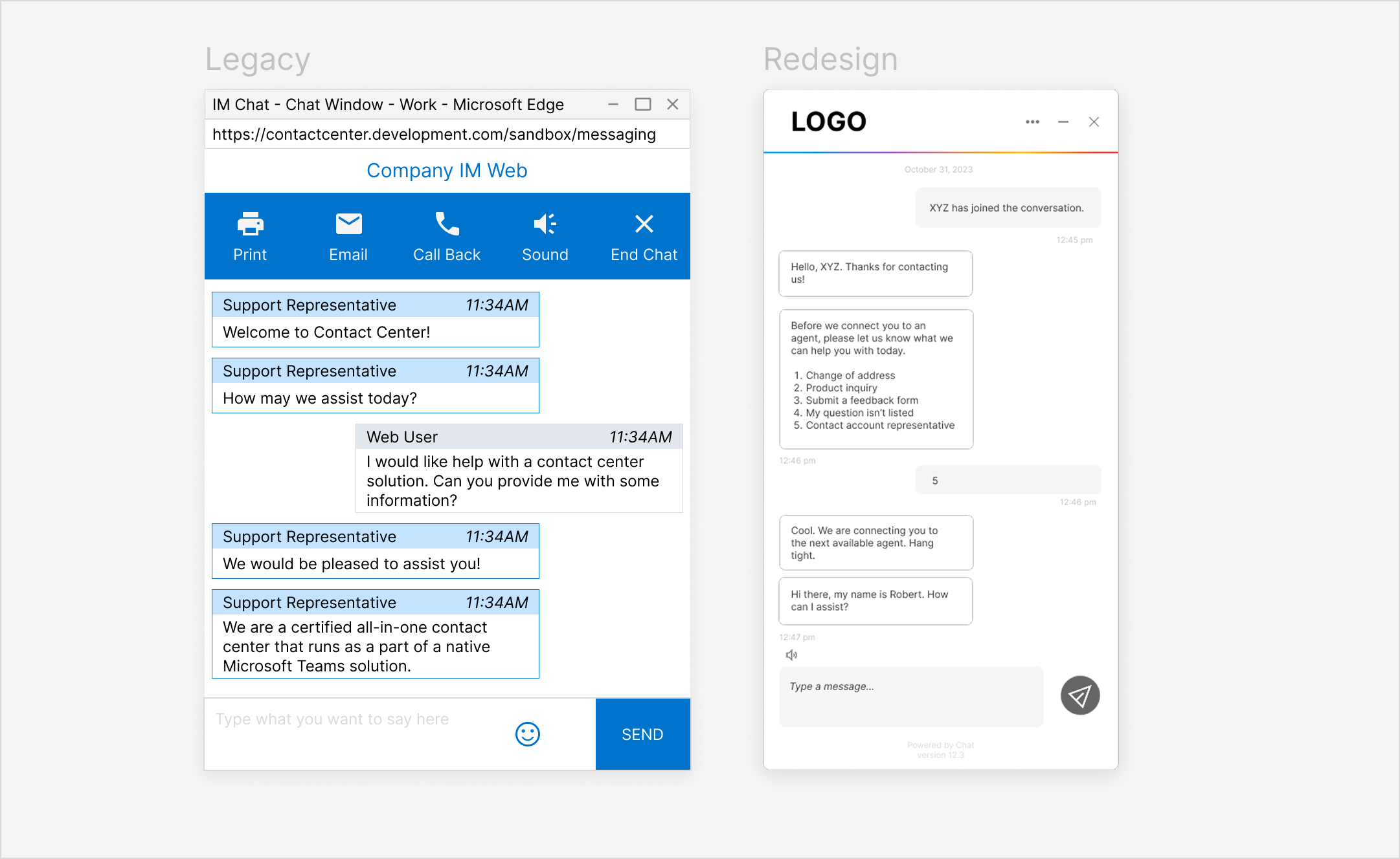
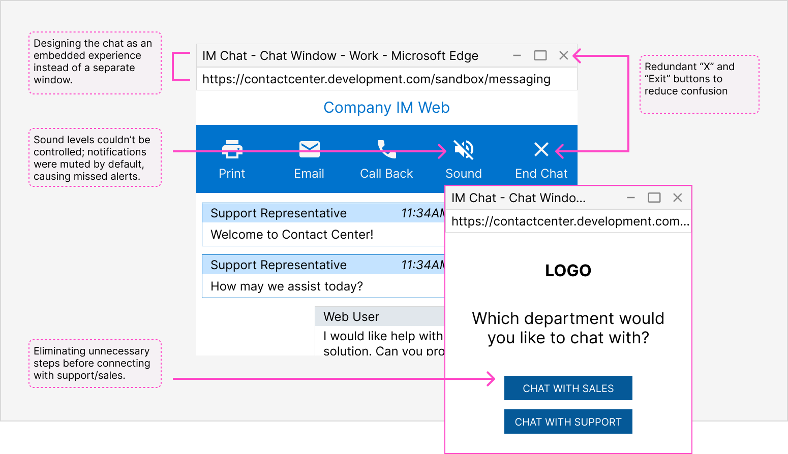
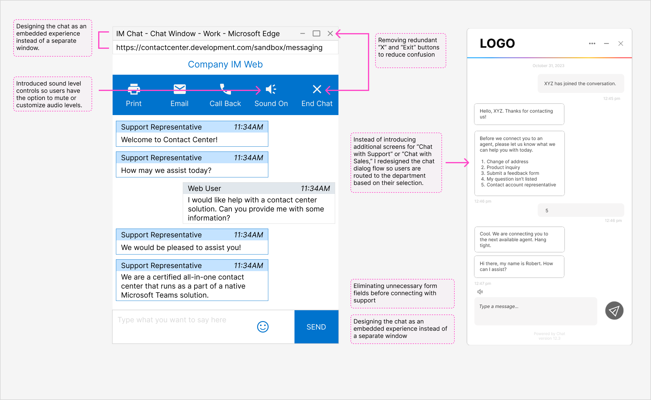
Rather than making it easy to reach sales and support, the existing web chat created friction. The experience felt fragmented due to a separate window, disruptive notifications, and unclear exit paths.
Solution
I redesigned the chat experience to be simpler and embedded within the page. The updated flow removed unnecessary steps, clarified entry and exit points, and aligned with modern UI patterns; making it easier for users to start, continue, and end conversations without disrupting their workflow.
Scroll down to read the full design process!
🔁 The Process
This redesign focused on refining an existing chat interface. Instead of full discovery, the work was guided by existing user feedback, internal insights, and platform constraints. I iterated on UI patterns and interaction flows through prototyping and internal review cycles.
What’s the problem?
To understand where the experience was falling short, I gathered input from internal stakeholders across sales, account management, and customer support: teams who regularly interacted with clients and had insight into recurring issues.
Across these perspectives, a clear theme emerged: users wanted a simple, less disruptive way to chat, so how might we make that happen?
This reframed the design challenge around reducing friction and interruptions throughout the experience.
Some pain points with the existing chat included:
DefineI focused on addressing the most impactful usability issues found through feedback and usage patterns. Given that 43% of users accessed chat on mobile, I prioritized a mobile-first approach to ensure the experience felt consistent, responsive and intuitive across devices. Design priorities included:
02
Embed the chat within the site so conversations persisted across page refreshes.
01
Simplify how users enter and exit the chat.
03
Modernize the chat interface by aligning the look and feel with modern UI patterns to create a more cohesive experience.
Design & Iteration Using these priorities as a guide, I redesigned the chat interface to focus on simplicity and ease of use.
Validation & Feedback While formal usability testing wasn’t part of the scope, the designs went through multiple review cycles with internal teams. This feedback surfaced additional and future iterations.
For example, some users noted that the notification chime still felt too loud, even after initial adjustments which highlighted the need for continued changes.
Some chat features were consistently underused, which surfaced opportunities to simplify the experience.
For example, we removed low-value options like the print feature (made redundant by the existing email option) and excess text-editor controls that added visual clutter without clear benefit.
💭 Reflection & Learnings
This project highlighted how seemingly small details, such as form fields, notification behavior, and exit patterns, can significantly affect user frustration. As the sole designer, I learned the value of collaborating closely with cross-functional partners, especially sales and account managers who regularly hear user feedback firsthand.