
Making it easier for enterprise clients to find answers and reduce dependency on support teams.
I designed a self-service portal for a B2B contact center platform so agents could find guides, FAQs, and updates in one place thus reducing repeat support requests and support team workload.
Note: I had the opportunity to work on a confidential project covered by a non-disclosure agreement. While I can't disclose specific client names, I'm proud to share the impactful work and contributions I made to the project.
ROLE UX Designer & Researcher
TOOLS Figma, FigJam, Whimsical
TEAM 1 developer, 1 product manager, 1 project manager
TIMEFRAME 8 weeks~
Problem
Clients using the contact center platform (many of whom are customer service agents themselves) struggled to find product guides, how-to videos, and updates due to the lack of a centralized resource hub. Resources were scattered across emails and shared links, which led to repeated requests and extra strain on our customer support team.
Solution
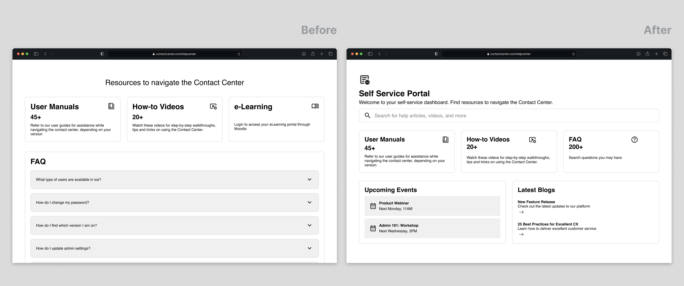
I designed and executed a self-service portal organized around four core resource categories: how-to videos, user guides, FAQ, and upcoming events/workshops. Now, clients can quickly find up-to-date information and resolve issues independently.
Scroll down to read the full design process!
🔁 The Process
Understanding the Problem Space
To understand how clients searched for resources and where breakdowns occurred, I combined qualitative research with data analysis.
Research methods I used:
INTERVIEWS
Spoke with internal customer support team members and external stakeholders to understand common issues, repeat requests, and current workarounds.
CONTENT AUDIT
Evaluated existing support materials to assess structure and discoverability.
SURVEYS
Collected feedback from existing clients to identify frustrations, commonly searched resources, and gaps in current support options.
COMPETITOR ANALYSIS
Analyzed similar customer support hubs to identify organizational patterns and opportunities.
DATA ANALYSIS
Reviewed Google Analytics on help-related pages to understand content engagement patterns.
🔎 What emerged from the research:
01
Clients struggled to stay informed about new releases, training opportunities, and upcoming events.
02
Clients wanted to find answers independently, rather than relying on customer support for some questions.
03
Clients preferred step-by-step guidance over long, static PDF documentation that was difficult to scan and navigate.
THE PROBLEM💡 Framing the design challenge
With the research findings, I focused on addressing the critical pain points.
How might we centralize key resources in one place?
How might we improve existing client self-service tools to ease the load on our support team?
How might we support users’ ongoing learning beyond basic troubleshooting?
These questions guided early brainstorming around the portal’s information architecture and content strategy.
Quotes from Interviews
“I have to check past email thread, shared drives, and old links just to find one document.”
Lack of centralized information
Important documents, FAQs, and guides were scattered, requiring agents to search multiple places.
“I need guides that match my system version… but I can never tell if I’m looking at the right one.”
No account-specific content
Customer service agents wanted personalized or version-specific documents but had no easy way to access them.
“I’d love to stay updated on new training workshops but I don’t know where to look for them.”
Lack of awareness on upcoming workshops, training, and updates
Customer service agents wanted access to relevant blogs, whitepapers, and training updates but had no centralized hub for these resources.
I adopted a design thinking approach emphasizing on our user needs throughout the process.
DESIGN & PROTOTYPING✏️ Translating Insights
I mapped out the ideal user journey and created wireframes in Figma, exploring various layouts for resource navigation.
I designed a low-to-mid fidelity prototype to demonstrate how a self-service dashboard could fit within the existing system. The final structure centered on four core resource categories: Videos, User Guides, FAQs, and Upcoming Events & Workshops.
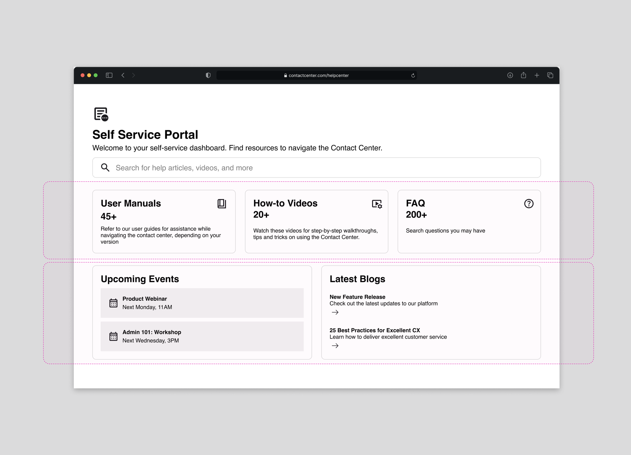
In the prototype, I emphasized layout, hierarchy, and filtering behavior to support a clear developer handoff. Because this work lived within an existing system, I focused on staying consistent with existing patterns rather than introducing new visual styles.
VALIDATION & ITERATION📝 Feedback Refinements
Due to tight timelines, formal usability testing with external users wasn’t feasible before launch. Instead, I validated the solution through internal walkthroughs and feedback sessions. Some of these refinements include:
01
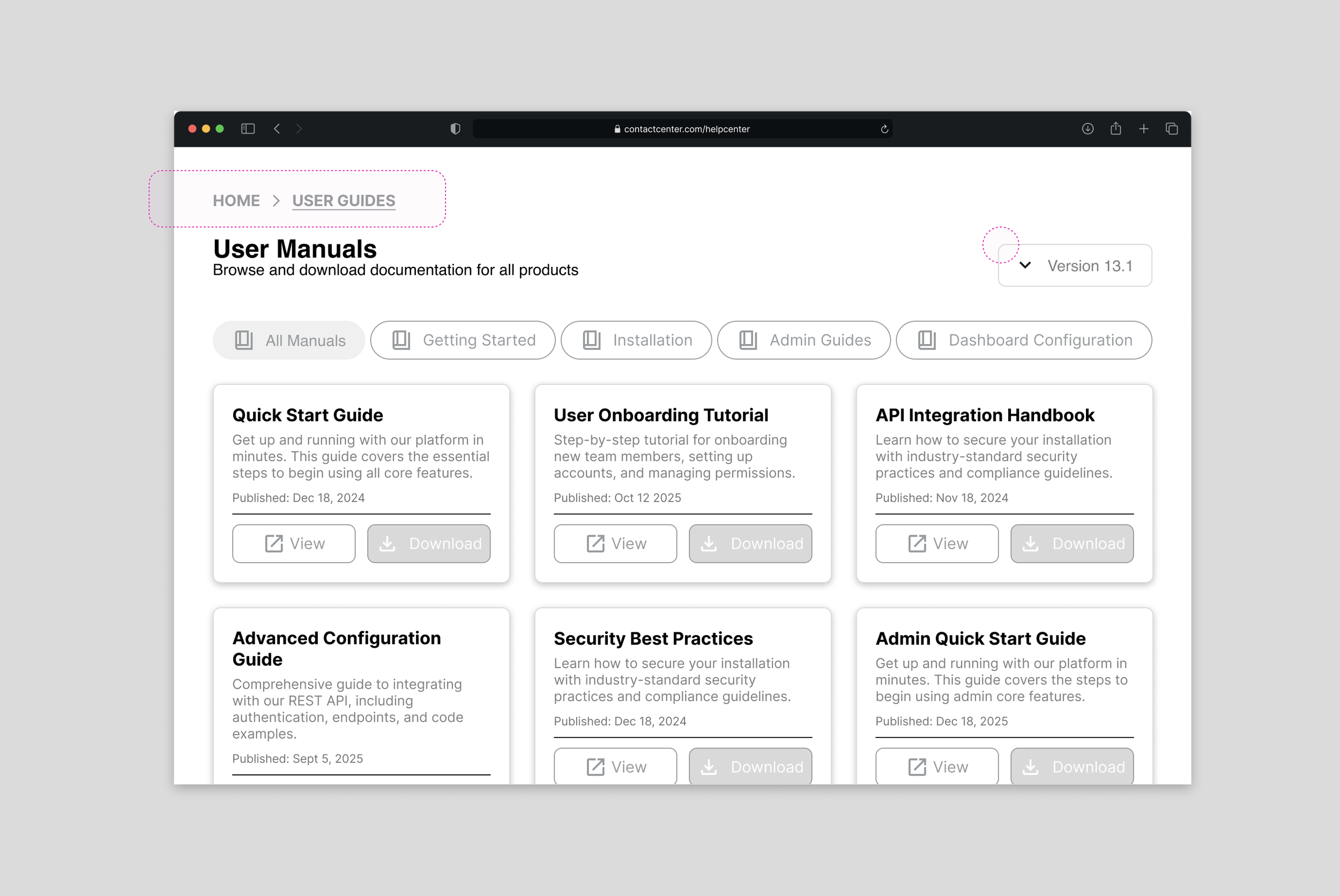
Adding breadcrumbs to improve orientation and back-navigation
02
Introducing version-based filtering for videos and guides
03
Creating a dedicated FAQ category to prevent long lists from becoming overwhelming as content scales
🔎 What I would test next
If time was not a constraint, I would test two things:
01 conduct usability testing with external clients to observe real search behavior.
02 measure success through ticket reduction and time-to-resolution.
💭 Reflections and learnings
As the portal evolves, user needs will evolve with it. This project reinforced the importance of spending time in research and continually asking why. While intuition can guide early ideas, meaningful design opportunities came from real user feedback.
Early developer collaboration
Bringing developers into the design process earlier would have helped validate technical constraints earlier especially around dashboard placement and content loading within the existing system.
Less is more
This project reinforced that simplifying content had greater impact than introducing additional functionality.
Working within constraints
Working within a tight timeline reminded me that I don’t need to solve everything at once. Focusing on two to three high-impact pain points made it possible to deliver meaningful improvements. It emphasized that this work is a starting point, with room to iterate as user needs grow and change.