Helping travellers compare destination with ease
Wayfarer is a conceptual travel platform designed to help users explore and compare destinations based on personal travel preferences. This project was completed as part of Designlab’s UX/UI Foundations course and focused on building core design skills, including interface design, visual hierarchy, and hands-on experience with Figma.
Problem
Travel planning can feel overwhelming due to the sheer number of destinations and options available, making it difficult for users to explore and compare places with confidence.
ROLE UX/UI Designer
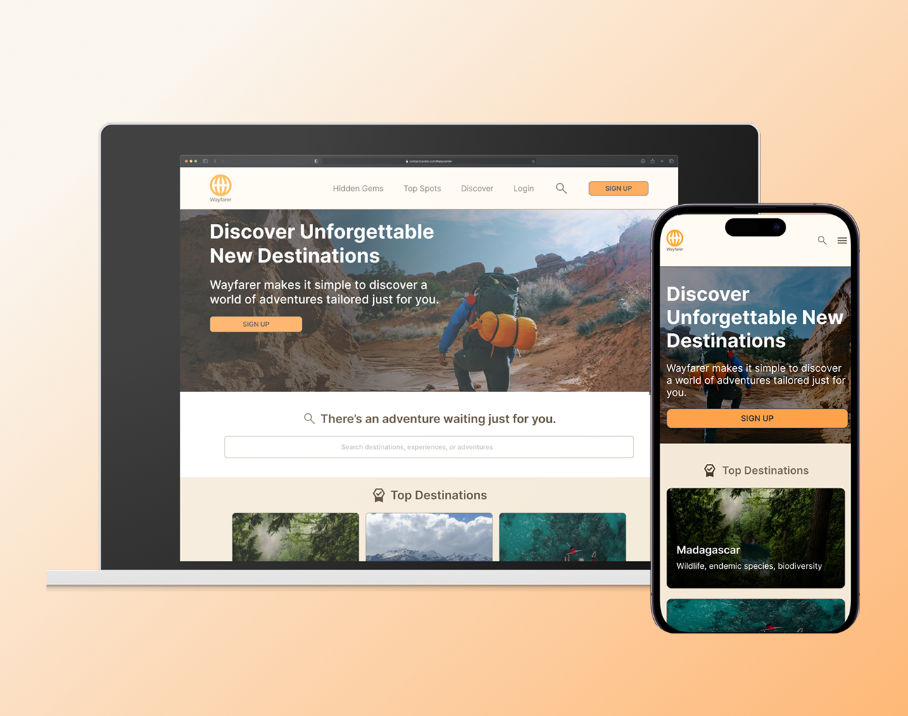
DELIVERABLE Mobile & Desktop
TIMELINE 3 weeks
TOOLS Figma
Solution
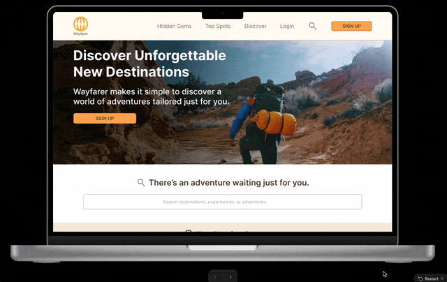
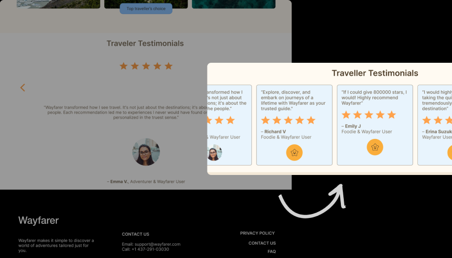
I designed a concept travel platform that simplifies destination discovery through preference-based exploration and clear visual hierarchy, helping users narrow options and make decisions with more confidence. This project explores how interface design and visual hierarchy can reduce that sense of overwhelm.
⬇️ Scroll down to read the full design process!
The Process
🎯 Understanding the objective
Travel planning can often feel overwhelming due to the sheer number of destinations and options available. So, how might we reduce the overwhelm of travel planning by making it easier to explore and compare destinations?
Rather than solving a fully validated user problem, this project emphasized learning and applying foundational design principles to create a visually clear and approachable interface.
Key Design Considerations 🤔
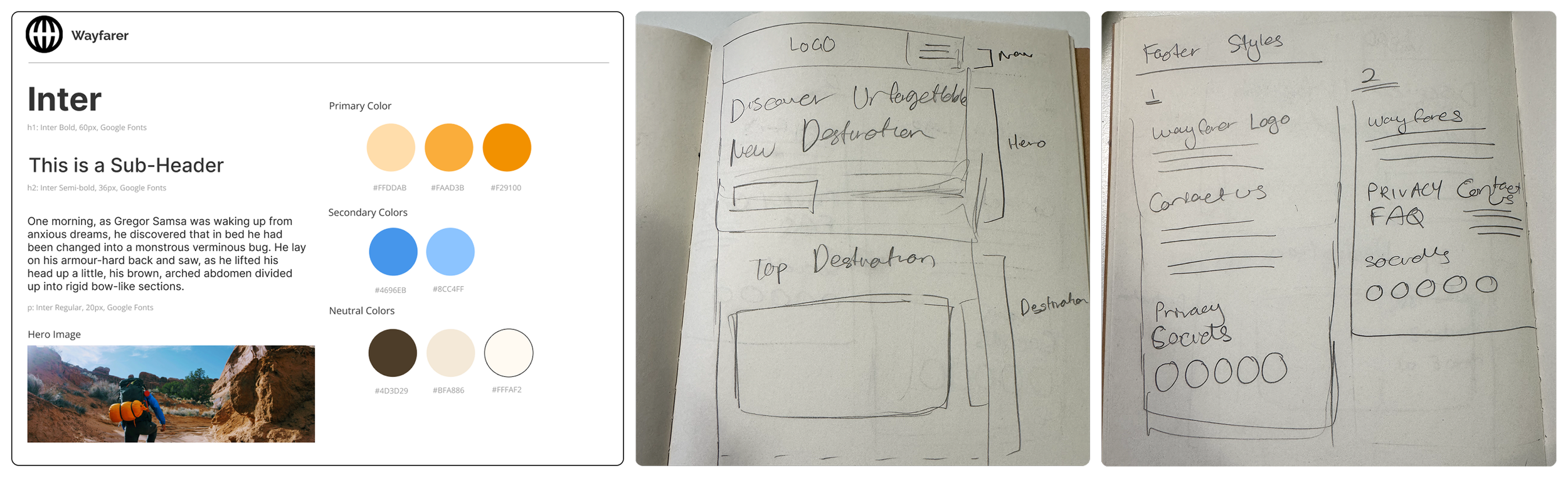
COLOUR THEORY
I chose a blue and orange colour palette to evoke a sense of adventure while maintaining strong contrast for readability and accessibility. This helped create visual interest without overwhelming the interface.
Course exercises and UX design heuristics (Nielsen's Heuristics, Gestalt Principles)
TYPOGRAPHY
I selected Inter for its high legibility, clean letterforms, and generous x-height, ensuring readability across different screen sizes and devices.
Design critiques from my mentor and peers
EARLY DESIGN EXPLORATION
Using pen and paper, I sketched low-fidelity wireframes to explore layout and flow. This allowed me to focus on structure and hierarchy before moving into detailed UI design.
➡️ Applying UX Foundations
Rather than formal user research, design decisions were guided by:
Common patterns observed in existing travel platform
WIREFRAMING
I created low-fidelity wireframes with sketches to map out the core structure and user flow, ensuring the interface felt logical before introducing visual styles.
PROTOTYPING
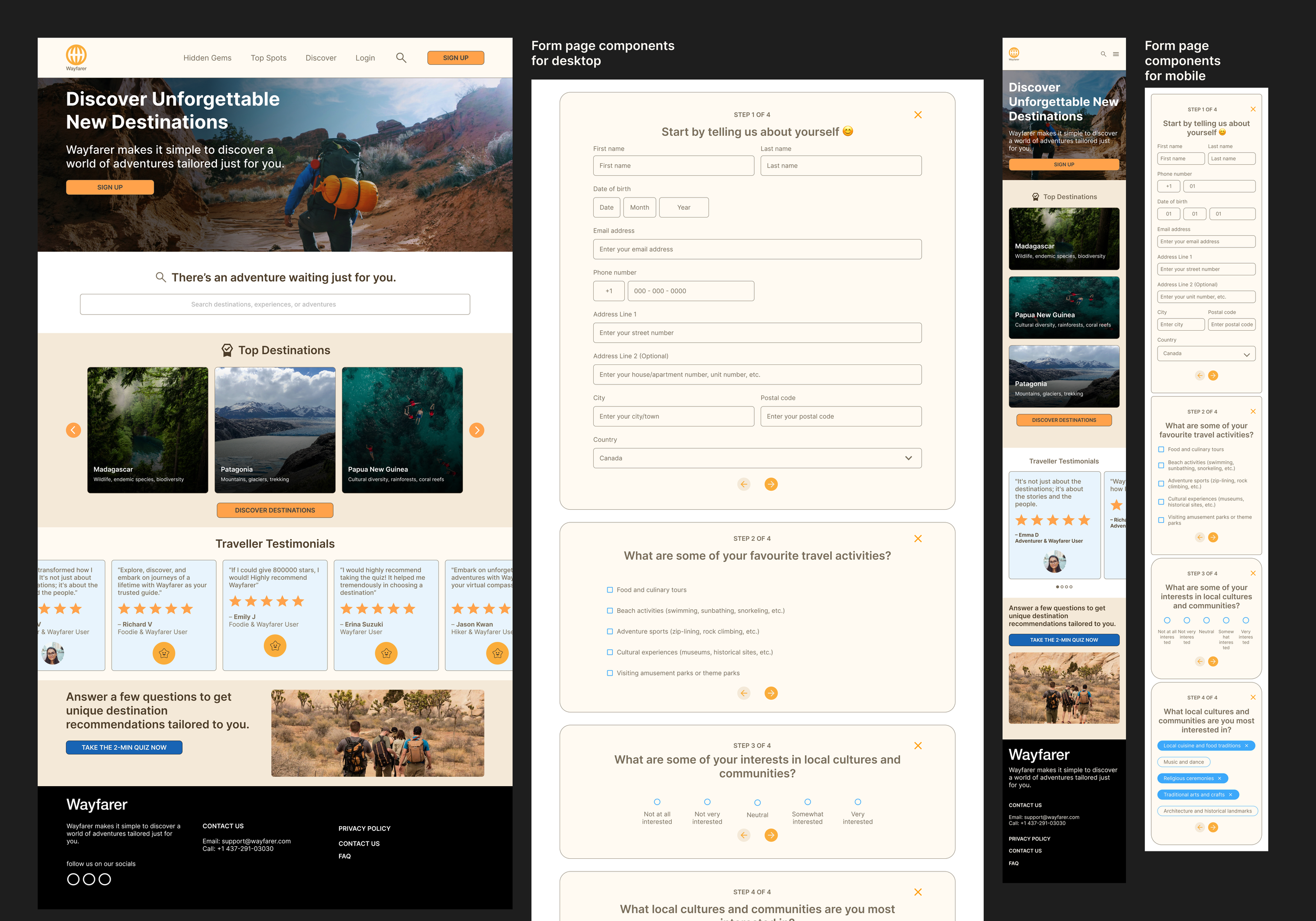
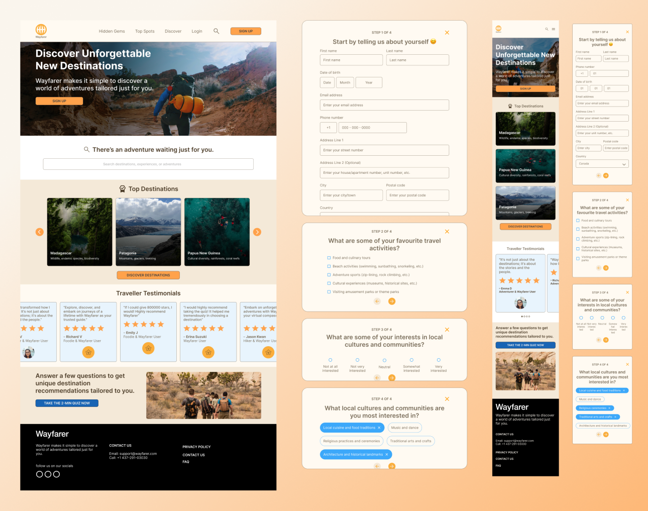
After wireframing, I moved into mid-fidelity prototypes in Figma. I explored layouts, color, and interaction states to understand how users would navigate the interface and compare destinations.
FEEDBACK & ITERATION
Designs were iterated based on mentor’s feedback and peer critiques, with a focus on improving hierarchy, spacing, and overall clarity.

💭 Key Learnings & Reflections
Designing with modularity
This project taught me the value of thinking in reusable components. Designing modular UI elements helped maintain consistency across screens and made iteration more efficient.
The impact of personalization
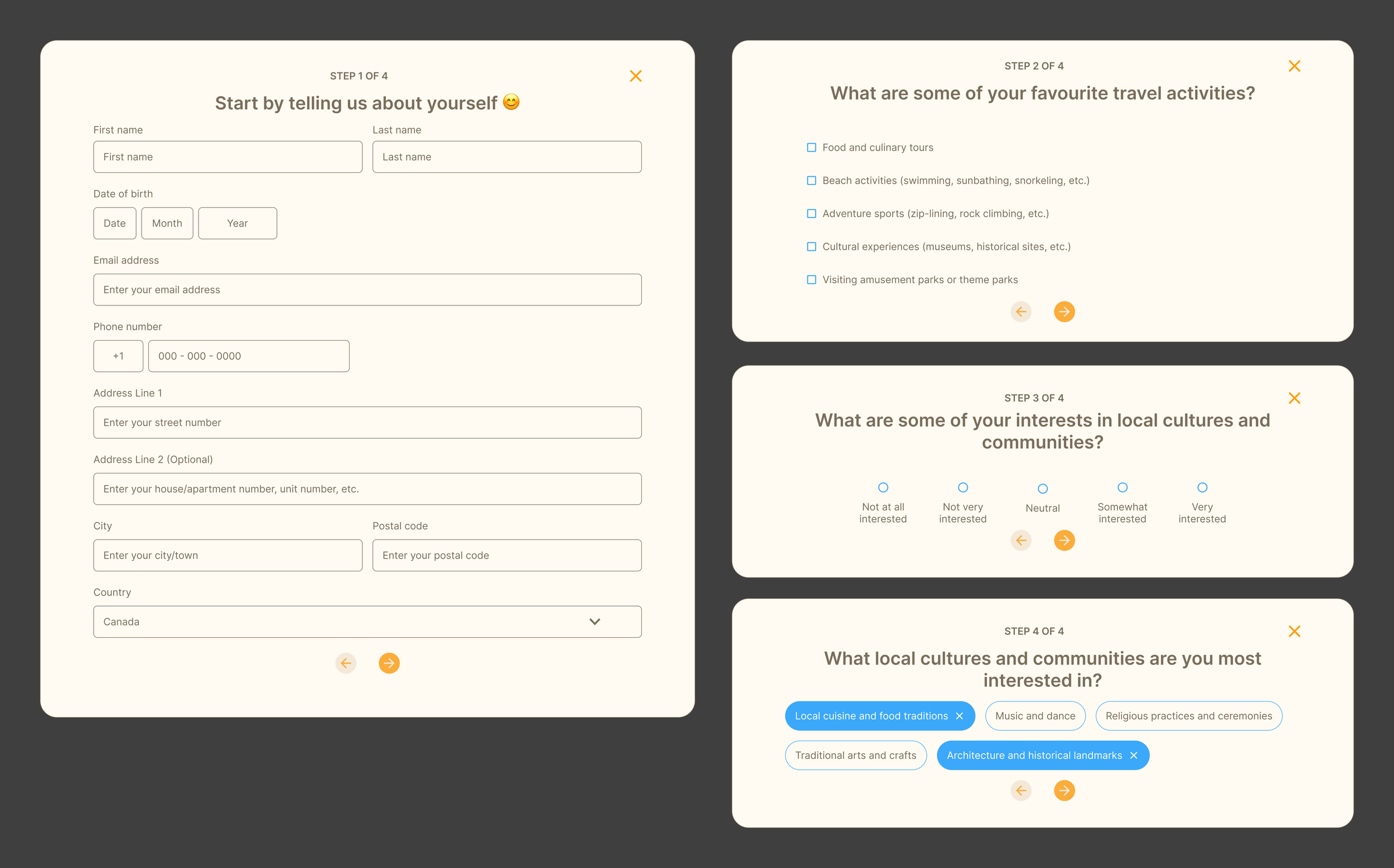
Designing preference-based questionnaires highlighted how personalization can make exploration feel more engaging and relevant, even at a conceptual level.
Learning from established design systems
Studying systems like Apple’s Human Interface Guidelines and IBM’s Carbon Design System reinforced the importance of leveraging proven UI patterns rather than reinventing the wheel.
Responsive, mobile-first thinking
Approaching the design mobile-first helped me think more intentionally about content prioritization and layout adaptability across devices.
Wayfarer represents my early stage as a designer and my introduction to UX/UI principles. If I were to revisit this project today, I would incorporate user research as the first step and validate assumptions through testing, and create components from the start.